

Recreate Your Github Repository Page With ReactJs and NodeJs


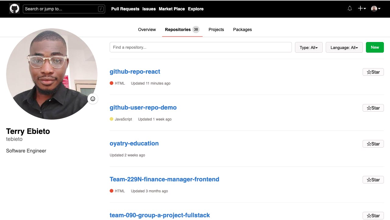
Let's recreate your Github repository page. The finished UI will be similar to the image above. And we will use live data from GITHUB GRAPHQL API.
You can clone the complete project here on github.
The React Frontend
Install NodeJs and NPM
Create new react project: npx create-react-app github-repo
- Copy and paste the code below in /github-repo/src/App.js
import React from 'react';
import { useEffect, useState } from 'react';
import Header from './components/header';
import Contents from './components/contents';
import { fetchProfileAndRepos } from './utils';

function App() {
  const [data, setData] = useState();
  const [avatarUrl, setAvatarUrl] = useState();
  useEffect(() => {
    fetchProfileAndRepos()
    .then(data => {
        console.log(data);
        setData(data)
        setAvatarUrl(data.userInfo.avatarUrl)
    })
    .catch(error => {
      console.log({error})
        alert("Check internet connection or refresh page")
    });
  }, []);

  return (
    <div className="App">
      {
        avatarUrl && <Header avatarUrl={avatarUrl} />
      }
      {
        data && <Contents data={data} />
      }
    </div>
  );
}

export default App;
Code Snippet Explanation
We split the entire application into two main components, Header and Contents, since it is just a page.
We imported and Rendered the Header and Contents Components. We also imported fetchProfileAndRepos function, that fetches basic user profile and repositories utilising Github GraphQL API. And we imported the useEffect and useState Hooks to fetch and store data in state respectively.
In /github-repo/src, create three new folders; components, assets and utils
in /github-repo/src/utils, create two new files, index.js and date.js
Copy and paste the code below in /github-repo/src/utils/index.js
import { getLocalTime } from './date.js';
const API_KEY_URL = `${window.location.origin}/api/key/github`;
const GITHUB_API_URL = 'https://api.github.com/graphql';


const queryGithub = maxReposLength => `
{
  viewer {
    login
    bio
    avatarUrl(size: 300)
    name
    repositories(first: 20, orderBy: {field: CREATED_AT, direction: DESC}) {
      edges {
        node {
          id
          name
          languages(first: 1) {
            edges {
              node {
                name
                color
              }
            }
          }
          updatedAt
        }
      }
      totalCount
    }
  }
}
`;

const fetchApiKey = () => {
  return fetch(API_KEY_URL, { method: 'POST' })
    .then(res => res.json())
    .then(data => data.key)
}

export const fetchProfileAndRepos = async () => {
    const GITHUB_API_KEY = await fetchApiKey();
    const options = {
        method: "post",
        headers: {
            "Content-Type": "application/json",
            "Authorization": `bearer ${GITHUB_API_KEY}`
        },
        body: JSON.stringify({
            query: queryGithub(20)
        })
    };

    return fetch(GITHUB_API_URL, options)
        .then(res => res.json())
        .then(result => {
            const { bio, login, name, avatarUrl, repositories } = result.data.viewer
            const userInfo = { bio, login, name, avatarUrl };
            const { totalCount, edges } = repositories;

            const repos = edges.map(repo => {
              const {name, updatedAt: time, languages} = repo.node;
              const updatedAt = getLocalTime(time);
              const edges = languages.edges[0];
              let lang;
              if(edges) lang = edges.node;
              return { name, updatedAt, lang };
            });

            return { userInfo, repos, totalCount};
        })
};
Code Snippet Explanation
We imported getLocalTime function for converting UTC time to Human readable format.
The fetchProfileAndRepos function get our github secret key from our local server, and then queries and return data from github graphql api via a POST request.
- Copy and paste the code below in /github-repo/src/utils/date.js
const getUTCString = (time, replace) => {
    return replace ? new Date(time.replace(/ /g,"T")+'Z') : new Date(time);
}

const fetchDate = date => {
    const months = ['01','02','03','04','05','06','07','08','09','10','11','12'];
    return date.getDate()+'/'+months[date.getMonth()]+'/'+date.getFullYear();
}

export const getLocalTime = time => {
    const now = new Date().getTime();
    const UTCString = getUTCString(time)
    const previous = UTCString.getTime();
    const difference = now -previous;
    const second_difference = ~~(difference / (10*10*10));
    const min_difference = ~~(difference / (60*10*10*10));
    const hour_difference = ~~(difference / (60*60*10*10*10));
    const day_difference = ~~(difference / (24*60*60*10*10*10));
    const week_difference = ~~(difference / (7*24*60*60*10*10*10));
    const month_difference = ~~(difference / (4*7*24*60*60*10*10*10));
    const year_difference = ~~(difference / (12*4*7*24*60*60*10*10*10));

    if(year_difference===1){
        return  `Updated ${year_difference} year ago`;
    }

    if(year_difference>1){
        return  `Updated ${year_difference} years ago`;
    }

    if(month_difference===1){
        return  `Updated ${month_difference} month ago`;
    }

    if(month_difference>1){
        return  `Updated ${month_difference} months ago`;
    }

    if(week_difference===1){
        return  `Updated ${week_difference} week ago`;
    }

    if(week_difference>1){
        return  `Updated ${week_difference} weeks ago`;
    }

    if(day_difference===1){
        return  `Updated ${day_difference} day ago`;
    }

    if(day_difference>1){
        return  `Updated ${day_difference} days ago`;
    }

    if(hour_difference===1){
        return  `Updated ${hour_difference} hour ago`;
    }

    if(hour_difference>1){
        return  `Updated ${hour_difference} hours ago`;
    }

    if(min_difference===1){
        return  `Updated ${min_difference} minute ago`;
    }

    if(min_difference>1){
        return  `Updated ${min_difference} minutes ago`;
    }

    if(second_difference<1){
        return 'Updated moments ago';
    }

    if(second_difference===1){
        return  `Updated ${second_difference} second ago`;
    }

    if(second_difference>1){
        return  `Updated ${second_difference} seconds ago`;
    }

    return fetchDate(UTCString);
}
Code Snippet Explanation
The getLocalTime function for converting UTC to Human readable format, following github's convention.
- Copy and paste the code below in /github-repo/src/components/header/index.js
import React from 'react';
import PropTypes from 'prop-types';
import menuIcon from '../../assets/menu.png';
import logoIcon from '../../assets/logo.png';
import notificationIcon from '../../assets/notification.png';
import addIcon from '../../assets/plus.png';
const Header = ({ avatarUrl }) =>(
<div id="header">
<img src={menuIcon} alt="menu" id="menu-icon" />
<div id="header-left">
<div id="logo">
<img src={logoIcon} alt="logo" />
</div>
<div id="header-search">
<input placeholder="Search or jump to..." type="text" />
<button>/</button>
</div>
<div id="header-links">
<div className="link">Pull Requests</div>
<div className="link">Issues</div>
<div className="link">Market Place</div>
<div className="link">Explore</div>
</div>
</div>
<div className="flex"></div>
<div id="header-right">
<div id="header-icons">
<button id="notification-btn">
<img className="icon" src={notificationIcon} alt="notification icon" />
</button>
<button id="plus-btn">
<img className="icon" src={addIcon} alt="add icon" />
<span>▾</span>
</button>
<button id="avatar-btn">
<img className="avatar" src={avatarUrl} alt="add icon" />
<span>▾</span>
</button>
</div>
</div>
</div>
);
Header.prototype = {
avatarUrl: PropTypes.string
}
export default Header;
Code Snippet Explanation
This is the Header component, it receives an avatarUrl prop. We can further split the Header component into smaller reusable components if we want, you can try.
- Copy and paste the code below in /github-repo/src/components/contents/index.js
import React from 'react';
import PropTypes from 'prop-types';

import RepoSection from '../repo-section';
import ProfileSection from '../profile-section';
import Tab from '../tab';

const Contents = ({ data }) => (
    <div id="contents">
        {
            <ProfileSection userInfo={data.userInfo} />
        }

        {
            <Tab totalCount={data.totalCount} />
        }

        {
            <RepoSection repos={data.repos} />
        }
    </div>
);

Contents.propTypes = {
    data: PropTypes.object
}

export default Contents
Code Snippet Explanation
We split the contents component into three smaller ones, ProfileSection, Tab and RepoSection. It receive a data prop, and passes userInfo, totalCount, and repos as props to its children respectively.
- Copy and paste the code below in /github-repo/src/components/profile-section/index.js
import React from 'react';
import PropTypes from 'prop-types';
const ProfileSection = ({ userInfo }) => (
<div id="profile-section">
<div className="profile">
<div className="avatar">
<img src={userInfo.avatarUrl} alt="" />
</div>
<div id="personal-info">
<div className="name">{userInfo.name}</div>
<div className="username">{userInfo.login}</div>
</div>
</div>
<button>
<span>☺</span>
<span id="set-status">Set status</span>
</button>
<div className="bio">{userInfo.bio}</div>
</div>
);
ProfileSection.propTypes = {
userInfo: PropTypes.object
}
export default ProfileSection;
Code Snippet Explanation
The ProfileSection component is where we displayed basic profile info of the user. It receives the userInfo prop.
- Copy and paste the code below in /github-repo/src/components/tab/index.js
import React from 'react';
import PropTypes from 'prop-types';


const Tab = ({ totalCount }) => (
    <div id="tab">
        <button>
            <span>Overview</span>
        </button>
        <button className="active">
            <span className="description">Repositories</span>
            <div className="count">{totalCount}</div>
        </button>
        <button>
            <span>Projects</span>
        </button>
        <button>
            <span>Packages</span>
        </button>
    </div>
);

Tab.propTypes = {
    totalCount: PropTypes.number
}

export default Tab;
Code Snippet Explanation
The Tab component renders the tab on the Github Repository Page. It receives a totalCount props which represents the total number of repositories by the user. We will not implement any other logic at this time.
- Copy and paste the code below in /github-repo/src/components/repo-section/index.js
import React from 'react';
import PropTypes from 'prop-types';

import Repos from '../repos';
import SearchRepo from '../search-repo';

export const RepoSection = ({ repos }) => (
    <div id="repo-section">
        <SearchRepo />
        <Repos repos={repos} />
    </div>
);

RepoSection.propTypes = {
    repos: PropTypes.array
}

export default RepoSection;
Code Snippet Explanation
We will display the user repos in the RepoSection component. But first we split into two smaller components, SearchRepo and Repos. It received a prop, repos, which is passed down to the Repos component.
- Copy and paste the code below in /github-repo/src/components/search-repo/index.js
import React from 'react';
const SearchRepo = () => (
<div className="search-repo">
<input placeholder="Find a repository..." type="text" />
<div className="search-repo-btns">
<div className="select-btns">
<button>
<span>Type: All</span>
<span>▾</span>
</button>
<button>
<span>Language: All</span>
<span>▾</span>
</button>
</div>
<button id="new-repo-btn">
<span>New</span>
</button>
</div>
</div>
);
export default SearchRepo;
Code Snippet Explanation
This is our SearchRepo components, It displays the search repository input form and buttons, but we will not implement any logic at this time, we just want to display the first 20 repositories of the user.
- Copy and paste the code below in /github-repo/src/components/repos/index.js
import React from 'react';
import PropTypes from 'prop-types';

import Repo from "../repo";

const Repos = ({ repos }) => (
    <div id="repos">
        {
         repos && repos.map((repo, key) => (
           <Repo key={key} repo={repo} />
         ))
        }
    </div>
);

Repos.propTypes = {
    repos: PropTypes.array
}

export default Repos;
Code Snippet Explanation
This is our Repos component, it receives a prop repos. it maps the repos array and passes each item down to a sub component Repo, where the items will be rendered.
- Copy and paste the code below in /github-repo/src/components/repo/index.js
import React from 'react';
import PropTypes from 'prop-types';
const Repo = ({ repo }) => (
<div className="repo">
<div className="repo-left">
<div className="repo-name">
<span>{repo.name}</span>
</div>
<div className="repo-other-info">
{
repo.lang ? (
<div className="lang">
<div className="lang-color" style={{backgroundColor:repo.lang.color}}></div>
<span>{repo.lang.name}</span>
</div>
)
: null
}
<div className="date">{repo.updatedAt}</div>
</div>
</div>
<div className="flex"></div>
<div className="star-btn">
<button>
<span>☆</span>
<span>Star</span>
</button>
</div>
</div>
);
Repo.propTypes = {
repo: PropTypes.object
}
export default Repo;
Code Snippet Explanation
This is our Repo component, it receives and render each repo passed into it as a prop.
- Download all images here and place them in /github-repo/src/assets
- Copy and paste the code below in /github-repo/src/index.css
body {
  background-color: #fff;
  margin: 0;
  width: 100%;
  font-family: sans-serif;
  overflow-x: hidden;
  min-width: 303px;
}


#header {
  background-color: #000;
  width: 100%;
  height: 58px;
  margin: 0;
  display: flex;
  flex-direction: row;
  align-items: center;
  overflow: hidden;
}

#header-left {
  display: flex;
  flex-direction: row;
  align-items: center;
  margin-left: 20px;
}

#header-left div {
  margin-left: 10px;
}

#header-search {
  border: 1px solid rgba(238, 238, 238, 0.432);
  border-radius: 5px;
  width: 260px;
  display: flex;
  flex-direction: row;
  justify-content: space-evenly;
  padding: 4px;
  transition: width 0.5s;
}

#header-search:focus-within {
  width: 500px;
  background-color: #fff;
  transition: width 0.5s;
}

#header-search:focus-within input::placeholder{
  color: #000;
}

#header-search:focus-within button {
  color: #fff;
  border-color: #fff;
}

#header-search input {
  background-color: transparent;
  color: #fff;
  width: 95%;
  border: none;
}

#header-search input:focus {
  outline: none;
  color: #000;
}

#header-search input::placeholder {
  color: rgba(238, 238, 238, 0.829);
  font-size: 14px;
}


#header-search button {
  background-color: transparent;
  color: rgba(238, 238, 238, 0.432);;
  border: 1px solid rgba(238, 238, 238, 0.432);
  border-radius: 5px;
  outline: none;
  margin: 0;
}

#logo img {
  width: 35px;
  height: 35px;
  cursor: pointer;
}

#header-links {
  color: #fff;
  display: flex;
  flex-direction: row;
  align-items: center;
}

#header-links .link {
  cursor: pointer;
  font-weight: bold;
  font-size: 14px;
}

#header-icons button{
  background-color: transparent;
  border:none;
  outline: none;
  color: #fff;
}

.flex{
  flex: 1
}

#header-right {
  margin-right: 20px;
}

#header-icons {
  display: flex;
  flex-direction: row;
  justify-content: space-evenly;
}

#header-right button {
  display: flex;
  flex-direction: row;
  justify-content: center;
  cursor: pointer;
  margin-right: 5px;
}

#header-right img {
  margin-right: 2px;
}

#header-right .avatar {
  width: 20px;
  height: 20px;
  border-radius: 100%;
}

#tab {
  position: absolute;
  top: 70px;
  width: 100%;
  display: flex;
  flex-direction: row;
  justify-content: center;
  border-bottom: 1px solid #ddd;
}

#tab button {
  margin: 5px;
  font-size: 14px;
  padding: 10px;;
  border: none;
  outline: none;
  margin-bottom: 0;
  display: flex;
  flex-direction: row;
  align-items: center;
  background-color: #fff;
  z-index: 1;
  cursor: pointer;
  border-bottom: 2px solid transparent;
}

#tab button:hover {
  border-bottom: 2px solid rgba(128, 128, 128, 0.623);
}

#tab .active, #tab .active:hover {
  border-bottom-color: salmon;
}

#tab .active .description {
  font-weight: bold;
}

#tab .count {
  margin-left: 5px;
  background-color: #ddd;
  border-radius: 25px;
  font-size: 12px;
  display: flex;
  flex-direction: column;
  justify-content: center;
  padding: 5px;
}

#contents {
  margin-top: 40px;
  width: 100%;
  display: flex;
  flex-direction: row;
  justify-content: space-between;
}


#profile-section {
  position: relative;
  top: -5px;
  z-index: 1;
  width: 25%;
  margin: 0 20px 0 20px;
}

#profile-section .profile .avatar {
  position: relative;
  width: 100%;
  border-radius: 50%;
  margin-bottom: 20px;
  overflow: hidden;
}

#profile-section button {
  background-color: #fff;
  border-radius: 25px;
  position: relative;
  bottom: 160px;
  left: 89%;
  border: 1px solid #eee;
  outline: none;
  width:  35px;
  height: 35px;
  box-shadow: 0 1px 2px 0 rgba(0,0,0,0.2);
  font-size: 24px;
  display: flex;
  flex-direction: row;
  justify-content: center;
  cursor: pointer;
}

#set-status {
  display: none;
  font-size: 13px;
  align-self: center;
}

#profile-section button:hover {
  width:  100px;
  justify-content: space-between;
  color: rgb(0, 110, 255);
}

#profile-section button:hover #set-status{
  display: block;
}

#profile-section .avatar img{
border-radius: 50%;
width: 100%;
}


#profile-section .profile .name{
  font-size: 25px;
  font-weight: bold;
}

#profile-section .profile .username{
  font-size: 18px;
  color: rgba(0, 0, 0, 0.568);
}

#profile-section .bio{
  font-size: 16px;
  margin-top: -15px;
  color: rgba(0, 0, 0, 0.767);
}

#repo-section {
  position: relative;
  top: 40px;
  width: 75%;
  margin: 0 20px 0 20px;
}

#repo-section .search-repo{
  border-bottom: 1px solid #eee;
  padding-bottom: 20px;
  display: flex;
  flex-direction: row;
}


#repo-section .search-repo input{
  height: 30px;
  padding-left: 10px;
  outline: none;
  flex: auto;
}

#repo-section .search-repo input:focus {
  border: 1px solid blue;
  box-shadow: 0 0 0 2px #88b8ffab;
}

#repo-section .search-repo button{
  height: 35px;
  background-color:  rgba(243, 239, 239, 0.582);
  outline: none;
  cursor: pointer;
  margin-left: 10px;
  padding: 1px 15px 1px 15px;
}

#repo-section .search-repo button:hover {
  background-color: rgba(243, 239, 239, 0.945);
}

#repo-section .search-repo input, #repo-section .search-repo button {
  border: 1px solid rgb(214, 207, 207);
  border-radius: 5px;
}

#repo-section .search-repo .search-repo-btns{
  display: flex;
  flex-direction: row;
  padding: 0;
}

#repo-section .search-repo #new-repo-btn{
 background-color: rgb(9, 170, 9);
 color: #fff;
 border: 1px solid rgb(9, 170, 9);;
 border-radius: 5px;
}

#repo-section .search-repo #new-repo-btn:hover {
  background-color: rgba(9, 170, 9, 0.842);
}

#repos .repo .lang .lang-color {
  width: 12px;
  height: 12px;
  border-radius: 25px;
  margin-right: 5px;
}

#repos .repo {
  margin-top: 30px;
  padding-bottom: 30px;
  border-bottom: 1px solid #eee;
  font-size: 12px;
  color: rgb(116, 108, 108);
  display: flex;
  flex-direction: row;
}

#repos .repo .repo-left{
  width: 90%;
}

#repos .repo-left .lang {
  display: flex;
  flex-direction: row;
}

#repos .repo .repo-name {
  font-size: 20px;
  color: rgb(51, 117, 216);
  font-weight: bold;
  margin-bottom: 20px;
  cursor: pointer;
}

#repos .repo .repo-name:hover {
  text-decoration: underline;
}


#repos .repo-left .repo-other-info {
  display: flex;
  flex-direction: row;
}

#repos .repo .lang {
  margin-right: 20px;
}

#repos .repo .star-btn button {
  background-color: rgba(243, 239, 239, 0.301);
  border: 1px solid rgb(214, 207, 207);
  border-radius: 5px;
  color: #000;
  font-size: 15px;
  outline: none;
  cursor: pointer;
  padding: 1px 10px 1px 10px;
  width: 70px;
}

#repos .repo .star-btn  button:hover {
  background-color: rgba(243, 239, 239, 0.966);
}

#menu-icon {
  display: none;
}

@media screen and (max-width: 800px) {
  #menu-icon {
      display: block;
      margin-left: 20px;
  }

  #header-icons button, #header-search, #header-links {
      display: none;
  }

  #header-icons #notification-btn {
      display: block;
  }

  #header-left {
      width: 100%;
      display: flex;
      flex-direction: row;
      align-items: center;
      justify-content: center;
  }

  #logo {
      position: relative;
      left: -20px;
  }

  #contents {
      position: relative;
      margin: 0;
      margin-top: 5px;
      flex-direction: column;
      justify-content: center;
      align-items: center;
  }

  #contents #profile-section, #contents #repo-section {
      position: relative;
      margin: 0;
      width: 95%;
      align-self: center;
  }

  #repo-section .search-repo .flex {
      display: none;
  }

  #repo-section .search-repo {
      flex-direction: column;
      margin: 0;
      align-items: center;
  }

  #repo-section .search-repo input {
      position: relative;
      margin: 0;
      width: 98%;
      max-width: 100%;
      margin-bottom: 20px;
      padding-left: 2%;
  }

  #repo-section .search-repo .search-repo-btns {
      width: 100%;
      margin: 0;
      justify-content: space-between;
  }

  #repo-section .search-repo button {
      margin: 0;
  }

  #tab {
      position: relative;
      top: 0;
      margin: 0;
      margin-top: 40px;
      overflow-x: auto;
  }


  #profile-section,   #profile-section .profile{
      width: 100%;
      margin: 0;
      top: 0;
      left: 0;
  }

  #profile-section button, #profile-section button:hover {
      position: relative;
      top: 0;
      left: 0;
      width: 100%;
      border-radius: 5px;
      justify-content: flex-start;
      margin-bottom: 20px;
  }

  #set-status {
      display: block;
      margin-left: 5px;
  }

  #profile-section .bio{
      margin: 0;
  }

  #profile-section .profile .avatar {
      width: 80px;
      height: 80px;
  }

  #profile-section .profile {
      display: flex;
      flex-direction: row;
      align-items: center;
  }

  #profile-section #personal-info {
      margin-left: 20px;
  }
}
Code Snippet Explanation
This is all the styles used for this project. We can make things cleaner by splitting the codes and moving them to their respective components. Our naming convention will make our splitting so easy. You can try.
The NodeJs backend
We will secure our github secret key and serve our react app with a NodeJs backend and then deploy the entire app to Heroku. But we will have to do all that in another post and I'll drop the link here when it's available.
Here is a link to the complete project on github, Frontend and Backend
And here is a link to the app deployed to heroku
Thank You.